
Fund My Future.
Turning the 80% allotment into a plan.
A wage-planning app for seafarers. Filipino crew are required to send most of their pay home as an allotment. Fund My Future shows where every peso goes and points part of that money at named goals the family can see grow.
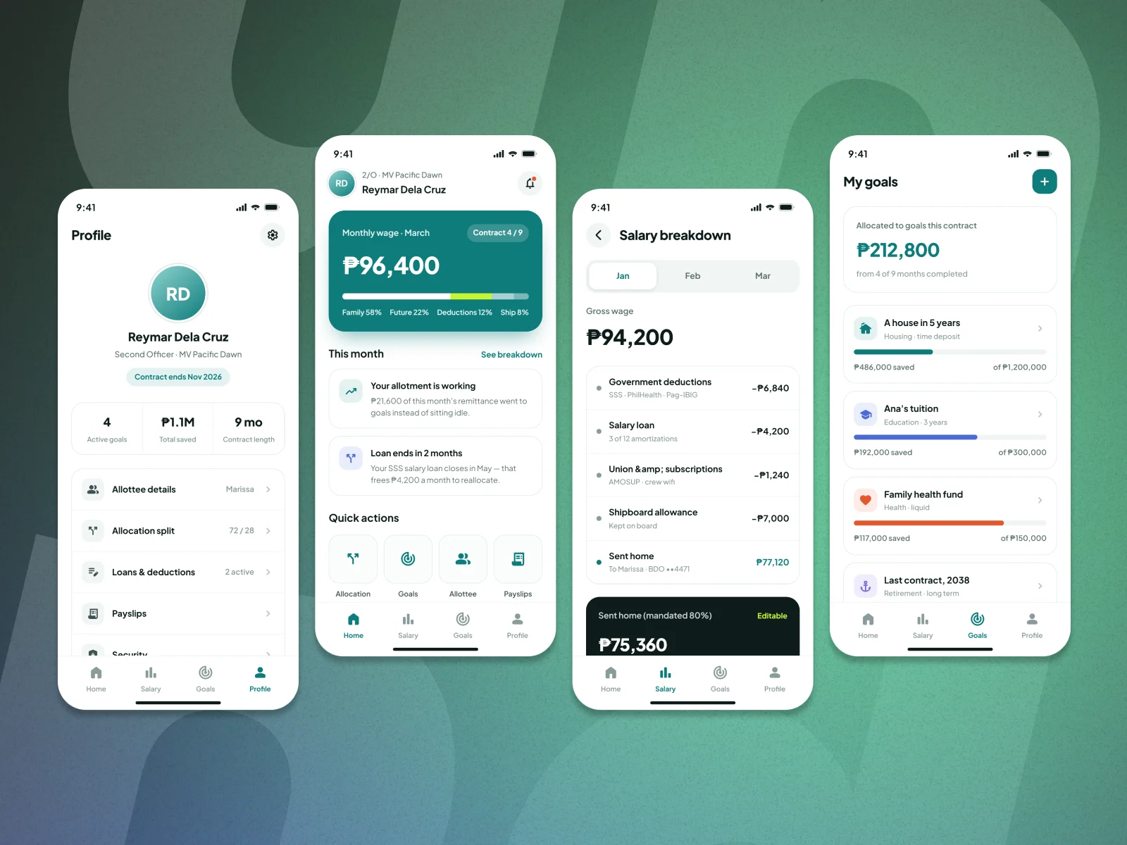
80% goes home. Then it disappears.
Filipino seafarers are required to send at least 80% of their basic wage to their family as an allotment. It’s a good rule, but on a payslip it reads like a loss: one big line that leaves, next to government deductions, loans and ship expenses.
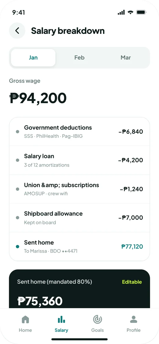
Terms like “SSS amortization” sit next to amounts with no context, so crew can’t tell what was taken and why.
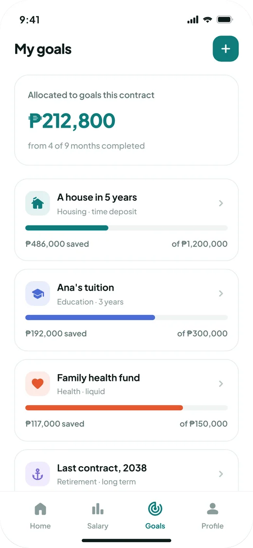
Families receive money every month, but there’s nothing that turns it into a house or tuition over a contract.
Crew are at sea for months, often on slow ship Wi-Fi, so anything that needs a call or an email is hard.
How might we help crew see their allotment as money put to work, not money sent away?
Same money, different story.
I mapped how money moves from the ship to the family, line by line from a real payslip. The rule couldn’t change, so the design changed how it reads: instead of one “allotment” line, the wage is split by what each part is for.
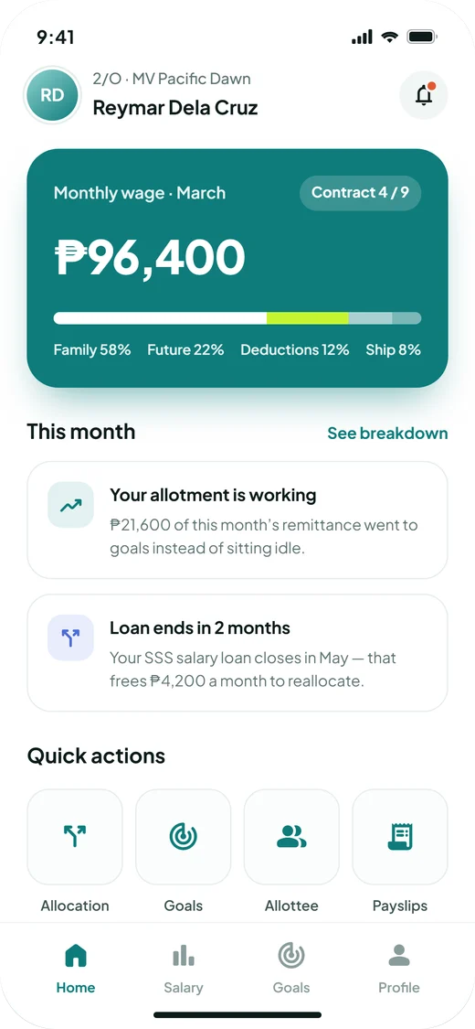
The same ₱96,400 monthly wage, read two ways. After: Family 58% · Future 22% · Deductions 12% · Ship 8%.
Four tabs, one question each
Plain words, one glance.
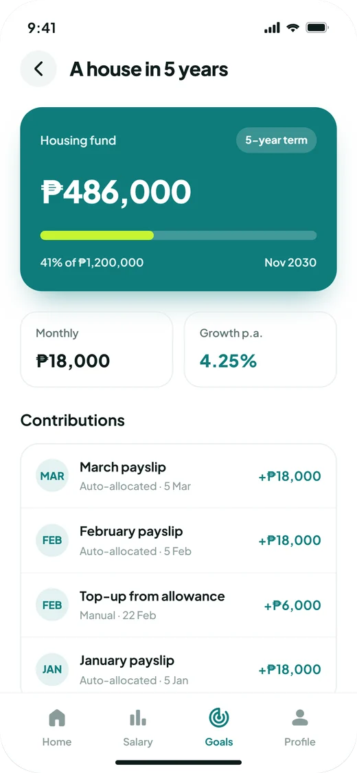
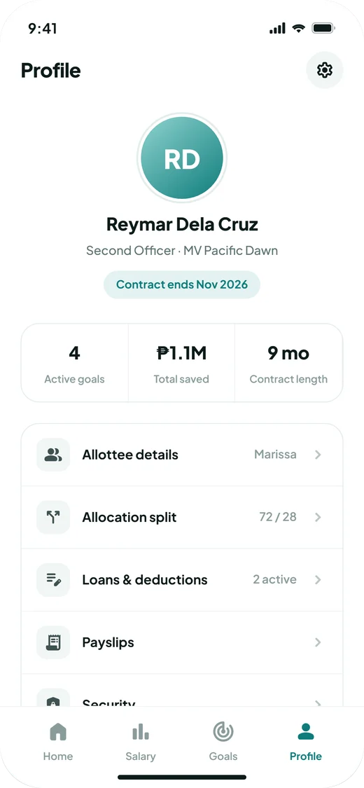
Many crew aren’t used to finance apps, so every screen answers one thing in everyday language, and the most important number is always the biggest thing on screen.
Colour
Deep teal for trust and money, a lime highlight for “future”, and a colour per goal so each one is easy to spot.
Words
“Your allotment is working” · “Kept on board” · “Sent home”
Every label was rewritten from payroll terms into everyday words, with a short subtitle where a term can’t be avoided.
Prototyped to feel real.
I turned the flows into a high-fidelity prototype with real numbers from a sample payslip, so the owner and executives could react to something that felt like the finished app.
Motion does a lot of the explaining: the wage bar fills and splits into its parts, so you can see money moving between buckets instead of reading about it.
Details I made sure to cover
- A wage split that always adds up to 100%
- Month-by-month payslips (Jan, Feb, Mar)
- Automatic and manual goal contributions
- Loans with progress, like “3 of 12”
- Which amounts are editable and which are mandated
How I’d know it works.
The goal isn’t a prettier payslip. It’s crew and families feeling in control of the money. These are the signals I’d track to keep improving it.
How many crew create at least one named goal in their first contract on the app.
Whether questions to the office about deductions and allotments go down.
A view for the allottee at home, so the family can watch the same goals grow.
What I learned
In money products, words matter as much as visuals. Renaming “allotment” into “Family” and “Future” changes how the same amount feels.
Design for the setting. Slow ship Wi-Fi and long contracts meant answers had to be visible in one glance.
When a rule can’t change, the story around it can. Reframing was the real design work here.