
Commerce Desk.
Every order, every deduction, before cut-off.
An operations dashboard for a crew commerce platform. Buyers order from merchants and pay through allotment deductions spread across payroll cycles. Commerce Desk gives the team one place to run the catalog, orders and merchants, and to catch a deduction at risk before payroll closes.
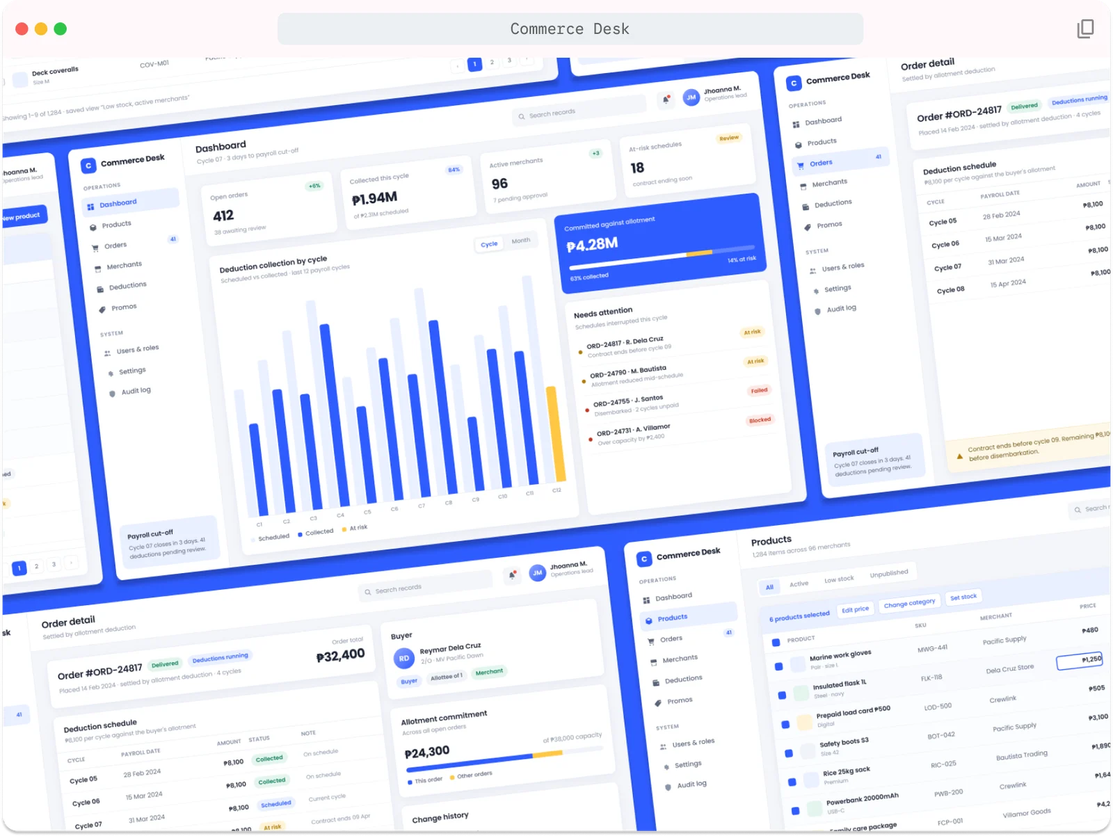
Payments that depend on payroll.
On this platform, buyers don’t pay at checkout. An order is settled through deductions from the buyer’s allotment, a fixed amount per payroll cycle until it’s paid off. That makes every order a small schedule that can break halfway through.
One order can run across several payroll cycles, so “paid” isn’t a single moment the team can check once.
A contract ends early, an allotment is reduced, a buyer disembarks. Each one quietly puts the remaining deductions at risk.
Catalog, orders, merchants, marketing and admin all work in it, each looking for something different.
How might we help the ops team spot a deduction problem before payroll cut-off, instead of finding it after?
Organised around the payroll cycle.
I mapped the tool with the ops team around the jobs they do every cycle, then split daily operations from system setup so each role finds its part fast.
Operations
- Dashboard
- Products
- Orders
- Merchants
- Deductions
- Promos
System
- Users & roles
- Settings
- Audit log
Key flow: fix a problem
- Dashboard flags it in Needs attention
- Open the order detail
- Check the deduction schedule and allotment
- Resolve before cut-off
Key decisions
- The cycle is the clock. The header always shows the current cycle and days to payroll cut-off, so urgency is never a guess.
- Problems come to you. At-risk schedules surface on the dashboard with the reason attached, like “Contract ends before cycle 09”.
- Every change is traceable. Orders keep a change history and the system keeps an audit log, because money is involved.
Calm by default, loud when it matters.
People spend whole days in this tool, so the base is quiet: white cards, one blue, lots of space. Colour is saved for status, so anything amber or red stands out right away.
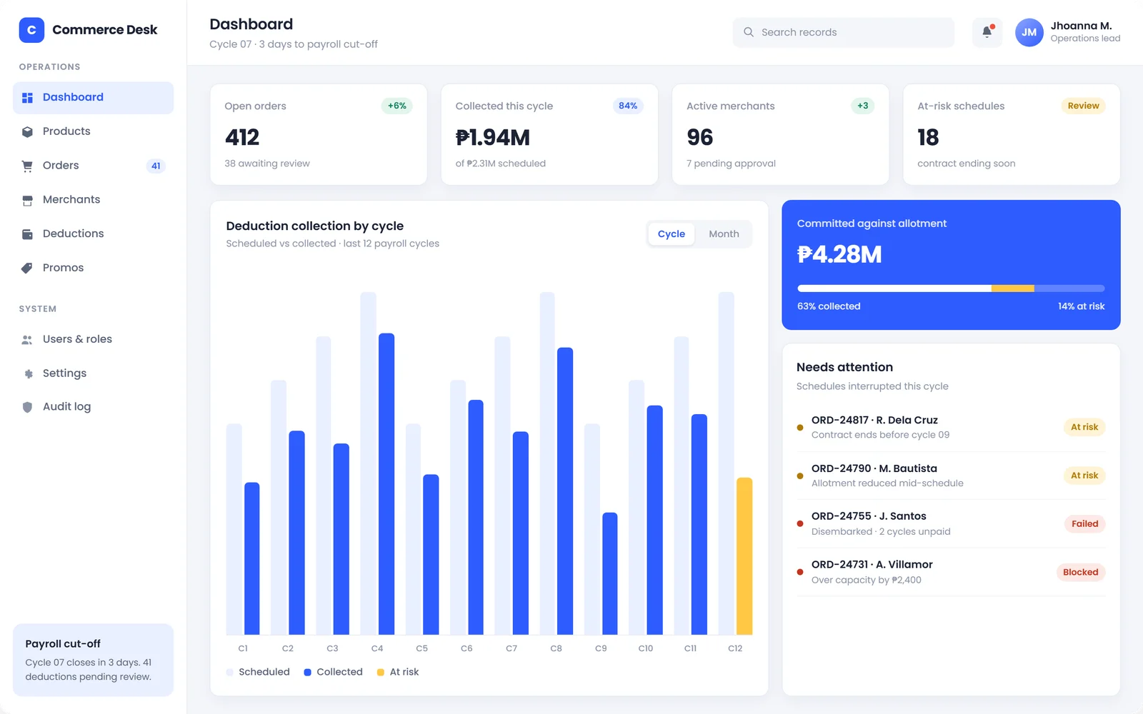
Dashboard
- Four numbers first: open orders, collected this cycle, active merchants and at-risk schedules, each with a hint of what to do.
- Scheduled vs collected per cycle, with the current at-risk amount in amber.
- Needs attention lists interrupted schedules with the reason and a clear status.
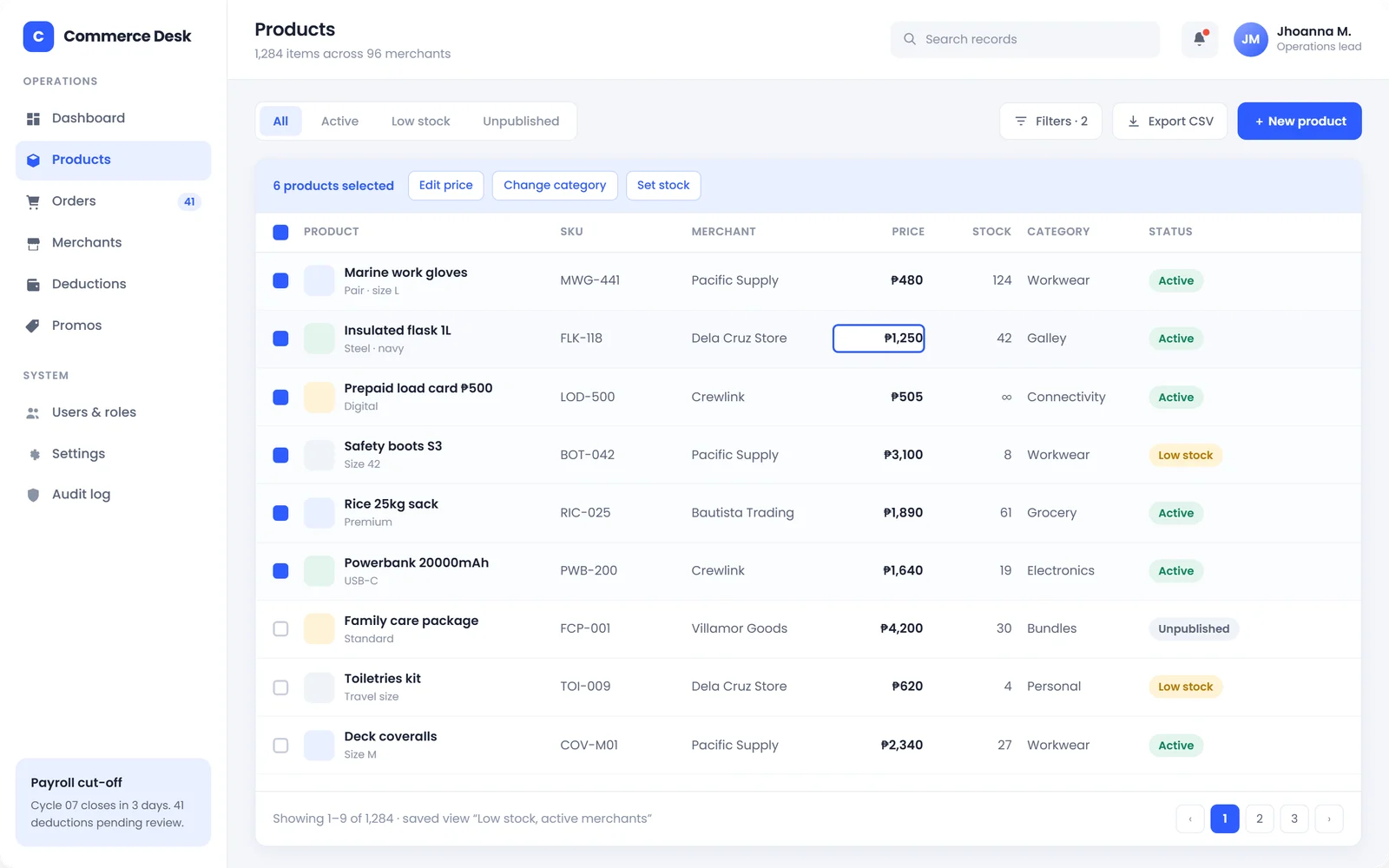
Products
- Saved views like All, Active, Low stock and Unpublished, so common filters are one click.
- Bulk actions appear only when rows are selected: edit price, change category, set stock.
- Inline editing for quick fixes like a price, without opening a form.
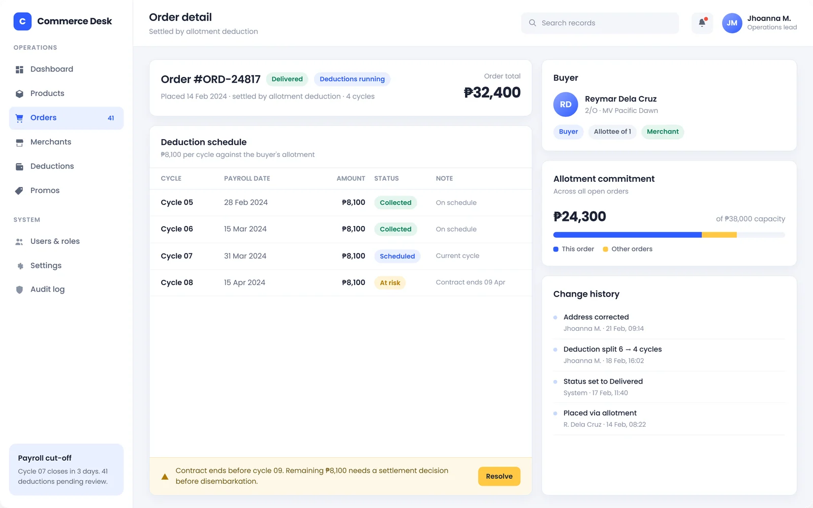
Order detail
- The deduction schedule shows every cycle with its date, amount, status and a note.
- Allotment commitment shows this order against the buyer’s other orders and total capacity.
- A resolve banner explains the problem in plain words and gives one clear action.
Status system
One set of badges across every page. Green is done, blue is planned, amber needs a look, red needs action now.
Layout rules
A fixed sidebar split into Operations and System, a header with search and the current cycle, and cards on a soft grey canvas. Money is always right-aligned and in bold, so columns are easy to scan.
Designed it, then built it.
I built the front-end myself in HTML, CSS and vanilla JavaScript, working with the backend developers on the data and with the ops team on the business rules.
Because the same person designed and coded it, the small things carried through: the badges, tables and cards in the mockups are the same components in the product.
Things I made sure to handle
- Deductions that are collected, scheduled or at risk
- Failed and blocked schedules with a reason
- Selected rows and bulk actions
- Low stock and unpublished products
- A change history on every order
Where it goes next.
Internal tools are never done. These are the improvements I’d explore next with the ops team.
When several schedules break for the same reason, let the team settle them together instead of one by one.
Flag orders whose deductions will run past a contract end date before they’re even approved.
Default views per team, so marketing lands on promos and catalog lands on low stock.
What I learned
In an ops tool, the best design is the one that tells you what to do next, not just what happened.
Understanding the business rules (cycles, allotments, cut-offs) mattered more than any visual choice.
Designing and coding the same screens keeps the details intact from mockup to production.